
Scandinavian Technology Institute
About the company
Scandinavian Technology Institute (STI) is a consulting company in the area of business development. The company provides a wide range of services, ranging from due diligence, sales training, digital marketing, video production, user testing, web design and more.
THE CHALLENGe
The purpose of the existing website was to show off as many services as possible. It had been created from the business’ point of view without properly taking into account the user’s perspective. The goal was therefore to create a user-centric website that enabled clients to quickly grasp how STI could help them.
Additionally, the website’s visuals had to be updated.
MY ROLE
I worked as a UX/UI designer as well as a web developer on this project. I was also in charge of moving the project forward. That includes finding and following up photographer and journalist.
The clients don’t get us
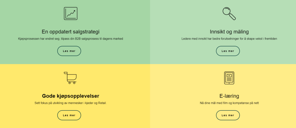
We kicked off the project with a guerilla test. We asked random people at a cafe a very simple question “What can this company do for you?”. Most respondents seemed confused about the overal purpose of the company.
Feedback from clients and even employees at STI backed up these opinions. “It seems like the company is trying to do everything for everyone, all at once”.
As the company was not going to let go of any of their 17 business areas, we had think of ways to instead group together these services.
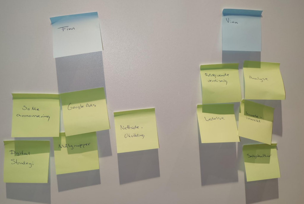
Together with company management we discovered that the most logical way to do so would be under three categories “Finn, vinn & behold”, translated into Find, win & keep.
We needed to validate these assumptions, and so we conducted a card sorting exercise where we asked participants to sort out all our services under those three categories.
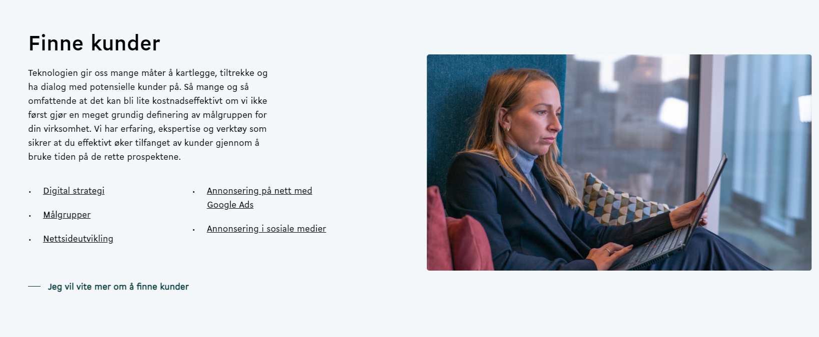
Some of the services did not immediately have a logical placement, and both their names and descriptions had be changed. All in all, the card sorting was fruitful and we ended up with an information architecture that seemed logical and ordered to the end user.
To further clarify the content, we wrote an explainer text telling users what to expect from each category.
Persona workshop
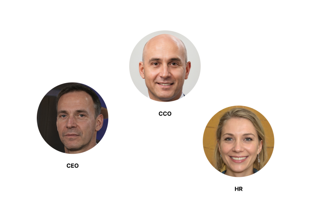
Our next step would be to update our existing personas. I gathered nine STI employees, including the top management for a persona workshop. We used analytics, and several years of experience from our top salesmen to write down and synthesize data.
We ended up with three main personas, representing the company’s most important business areas. These would be our focus moving forward with the website update. Additionally, I talked to some of our clients to further validate or edit these personas.
Content audit
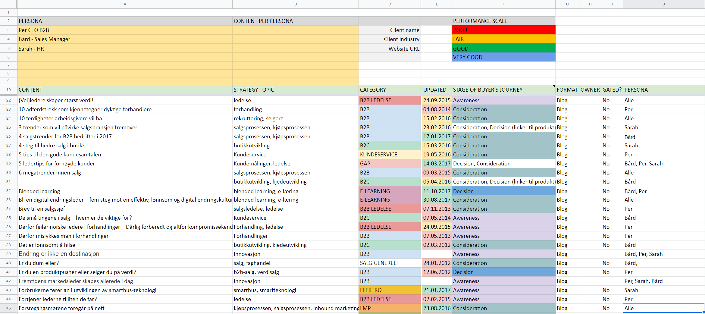
STI had long been enthusiastic about blogging as this generated organic traffic to the website. Unfortunately, most of the blog texts (as well as the website texts) had been written without a specific persona in mind. Additionally, the texts were written without a proper placement/step in the inbound funnel.
So we took upon us the challenge of reading and lightly editing all 130 blog texts. These were the steps we followed:
- Identify which persona the text is, or should have been written for
- Identify which stage of the inbound funnel the text should be placed at: Attract, Convert, Close or Delight
- Decide if the blog post is still relevant. If not, archive it
- Edit the text to tie it up to the aforementioned points.
Luckily, we were four team members doing this, so it didn’t take forever (although, admittedly, it felt like it at times).
For the website copy, I coordinated with a journalist (the writer of the Norwegian movie “Lange Flate Ballær”) who sent us updated persona-centric website texts.
A new design is born
With personas, content audit and information architecture in place, as well as a competitor’s analysis performed by one of my colleagues, it was time to create the website.
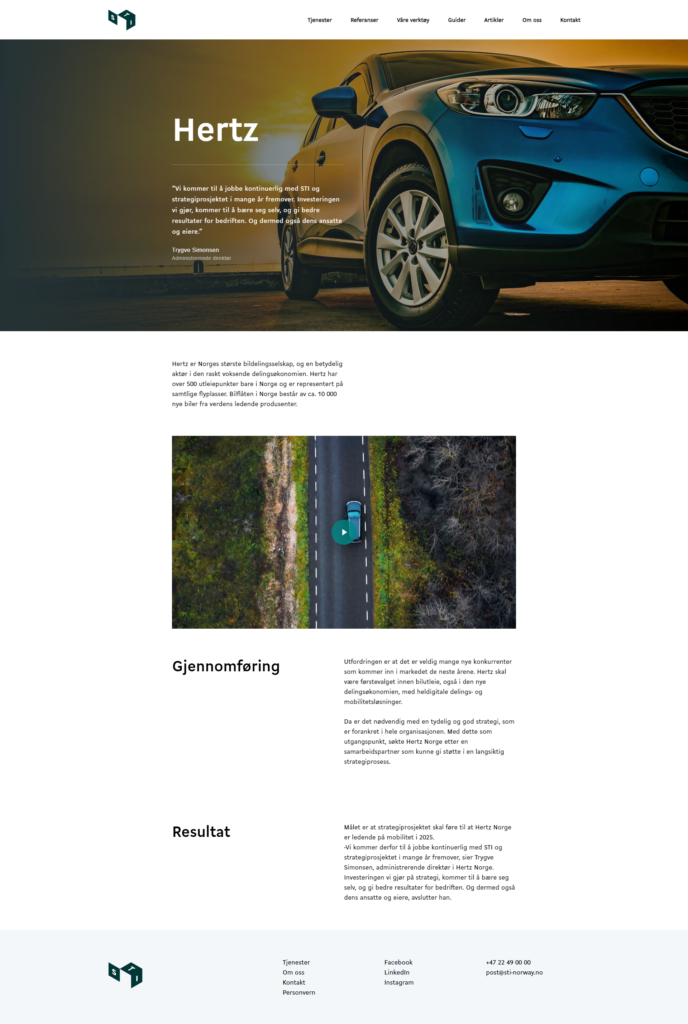
I decided to go for a minimalistic, clean design with large images and a heavy use of whitespace in order to give the substantial amount of information some breathing space.
Testing
We repeated the user testing with the same simple question as before we started this project “What can this company do for you?”. This time we asked representatives of the three user personas. In general, most users would immediately understand the Find, Win & Keep concept.
There were still some comments about STI having a foot in several business areas at once, but the users would know where to place their needs.
The company was heavily hit by the pandemic, but still saw a 10% increase after the website was launched.