Mentra by SATS
About the company
Mentra is a startup owned by SATS – the largest fitness provider in the Nordics.
The startup was born during the pandemic with “Rflex”, a fitness device where the users can mirror themselves as they work out with one of the 700 included gym classes from Scandinavia’s top coaches.
Initially, buying a Rflex was the only way you could consume these classes, but this was quickly changed and today all classes are available on mobile app and on any computer.
THE CHALLENGe
As with any startup, the challenges were aplenty, from fine-tuning the user personas, user testing the physical as well as the digital product, creating an engaging user interface, adding enough features, and more – all sooner, rather than later.
MY ROLE
As the only designer in Mentra’s development team of 10 people, I was responsible for UX and UI design for both the mobile app, as well as the Rflex (exercise mirror). I worked through the entire process from initial analyzing and prioritizing, via user research, to finished mockup.
With an understanding of HTML, CSS, JavaScript and WordPress web development, I communicated daily and closely with the development team.
Testing, tons of testing
Before launching the Rflex to the wider market, I was in charge of testing the MVP version of the product.
The mirror was sent out to 100 participants in Sweden and Norway. 35 of these were interviewed in-depth during a five week testing period.
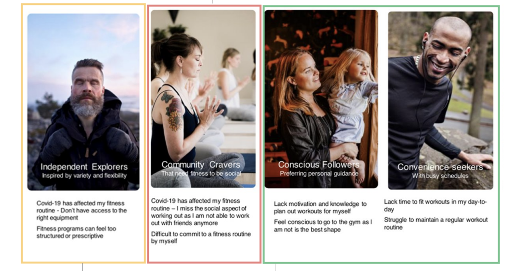
All 100 participants that were part of the study had to fill out a short questionnaire so we could place them amongst the four target personas, pictured above. Meanwhile, the 35 people we interviewed were selected by their various levels of Rflex usage, age, gender, persona and availability.
Participants were required to fill out a weekly diary study, providing us with a lot of data, both quantitative, and qualitative.
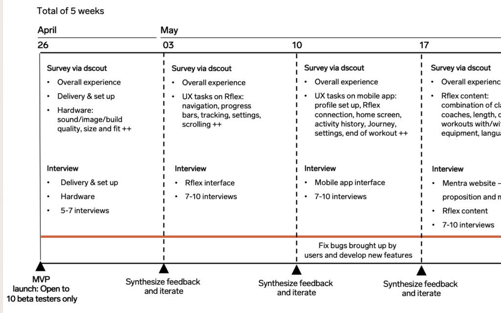
Each of the five weeks had a new focus area, starting with delivery and hardware and ending up with customer service
The findings were synthesized and presented to the entire Mentra team, as well as the stakeholders, and resulted in several changes being made, both on the software and hardware side, these are some:
- users were often logged out, the entire system ended up being replaced,
- loudspeakers were too low and sounded sub-par, they were replaced
- interface had elements that were placed either too high or too low when working out in front of the mirror, this was redone
- the menu system was unclear, so we added new icons and text labels
The mobile app gains focus
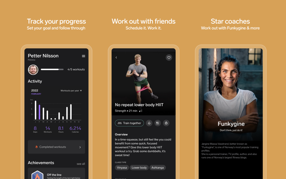
As we wanted more users to access Mentra’s content, the focus was moved from the Rflex to the mobile app, and this is what I spent most of my time working with at the company.
I came into the project around six months after the startup had been formed and much of the app’s design was in its first iteration, serving the function of a companion app to the Rflex. And as much had been done in a hurry, most designs had to be changed.
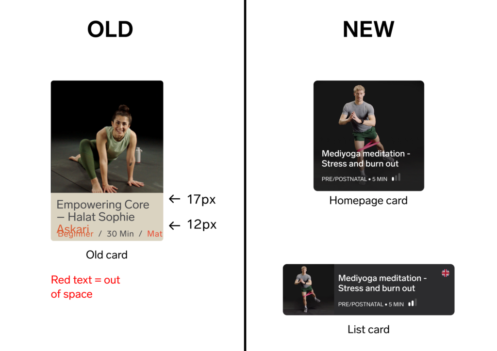
No space left
The first major UI change, one that would affect nearly all parts of the app, was a seemingly simple one – enlarging the font size.
Many of the app’s designs were scaled down versions of the human sized Rflex, and as such we had fonts ranging from 11 to 4 pixels – bare legible and not approved by the WCAG. Several users had also complained about this issue.
We followed Apple’s Human Interface Guidelines and ended up with a body size of 17 pixels. This had an implication on the old cards, as they simply did not have enough space to fit all the newly sized content. New cards were made, one for the Netflix style homepage, and one for all other lists. The change was received positively by users.
The design system gets redone
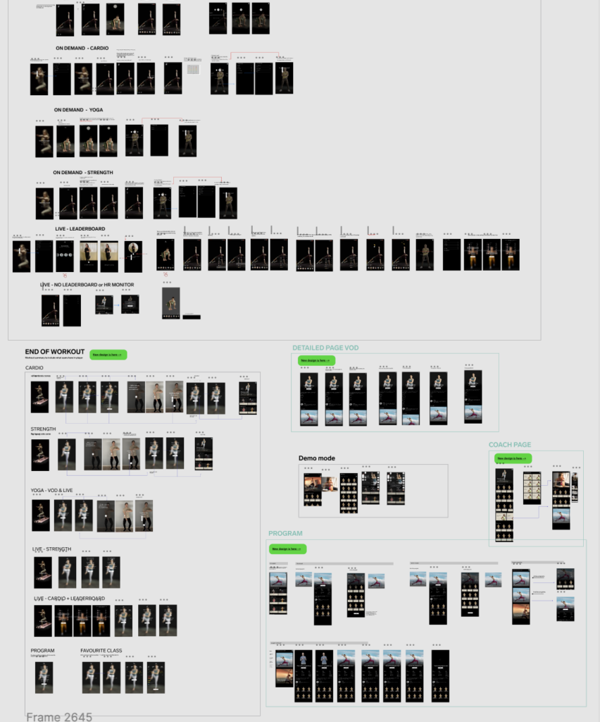
The old design system included all Rflex and app designs on one single page, making it hard to find the correct design, especially for the developers that do not work with Figma as their main tool (it also crashed my computer more than once). The above image shows 1/5 of the designs Figma file.
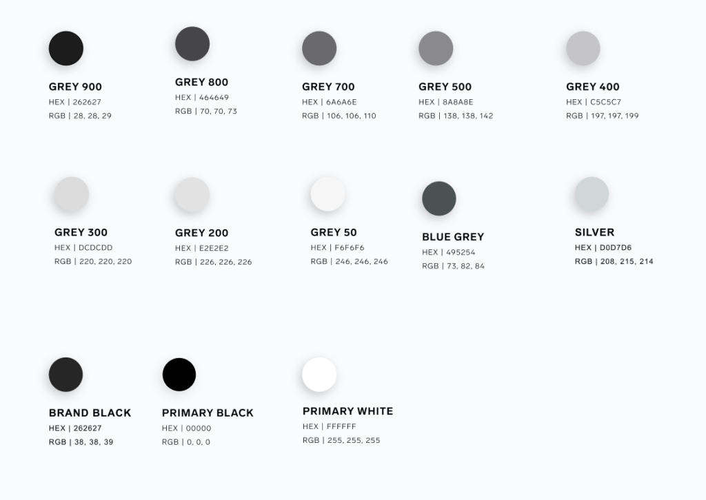
Additionally, there were around 100 variations of the fonts, and 13 shades of gray. Selecting the correct combination seemed to be guesswork.
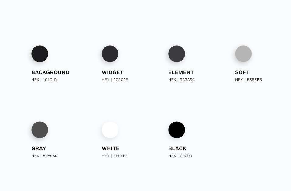
The color problem was solved by scaling down on the amount of gray shades, and by aptly naming all the colors in terms of their usage.
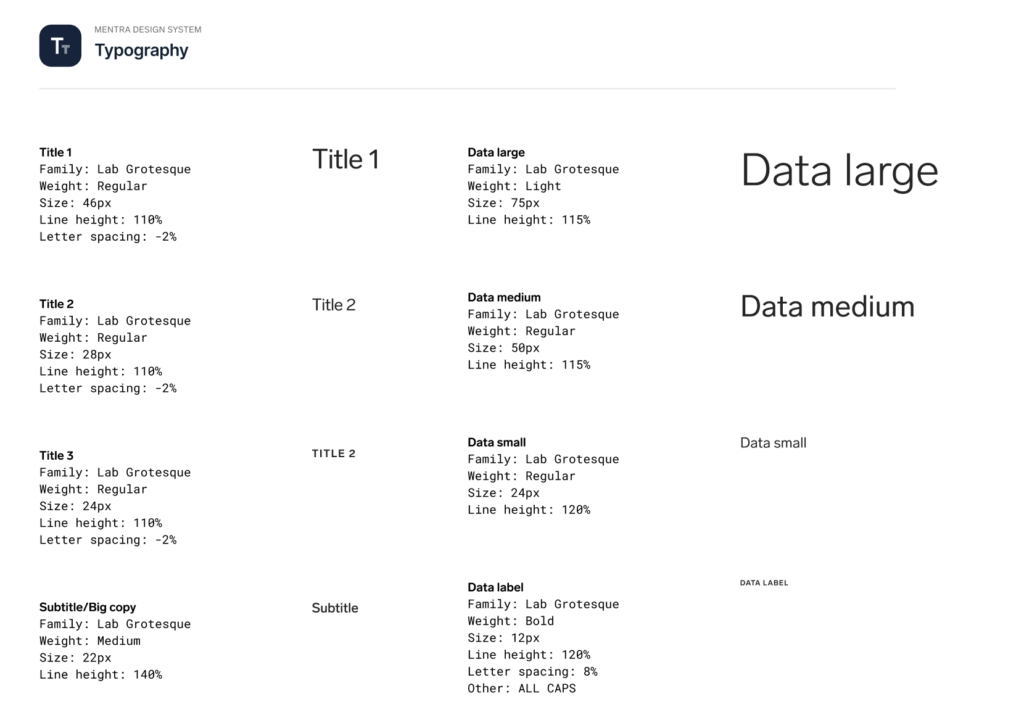
The fonts were also adjusted and presented in a way that removed the guesswork for the developers, making design handover much simpler.
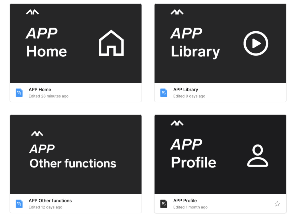
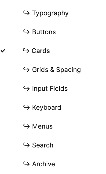
All designs were split by device, and categorized by navigation, and then sorted by function, making finding any design as easy as navigating on the devices themselves.
Finally, all components were sorted by their type. This ensured reusage of the same components everywhere, making the user experience clean and consistent
More testing
To make sure we were creating the best possible app, we had several rounds of user testing. We gathered data from surveys, interviews and analytics. Support tickets and feature requests were also monitored.
Let’s not forget about the bike!
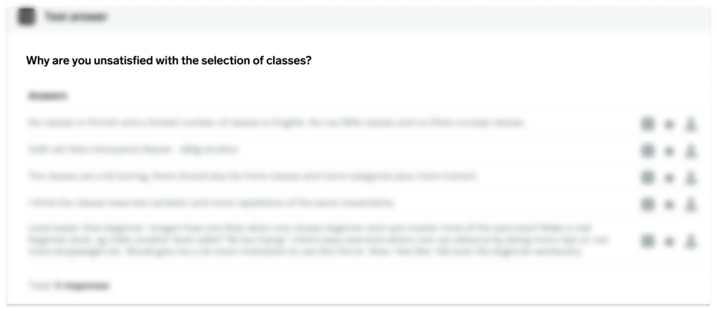
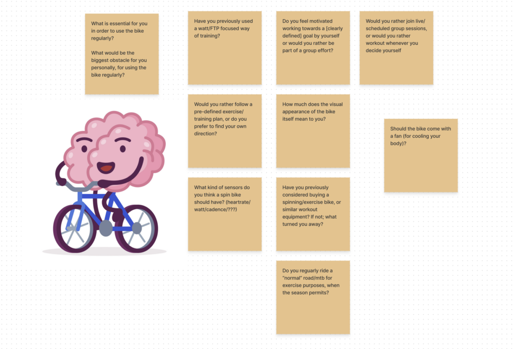
A future project that may be or may not be released is Mentra Ride, the fitness bike. The below image shows some of the questions we asked users in the early ideation phase.
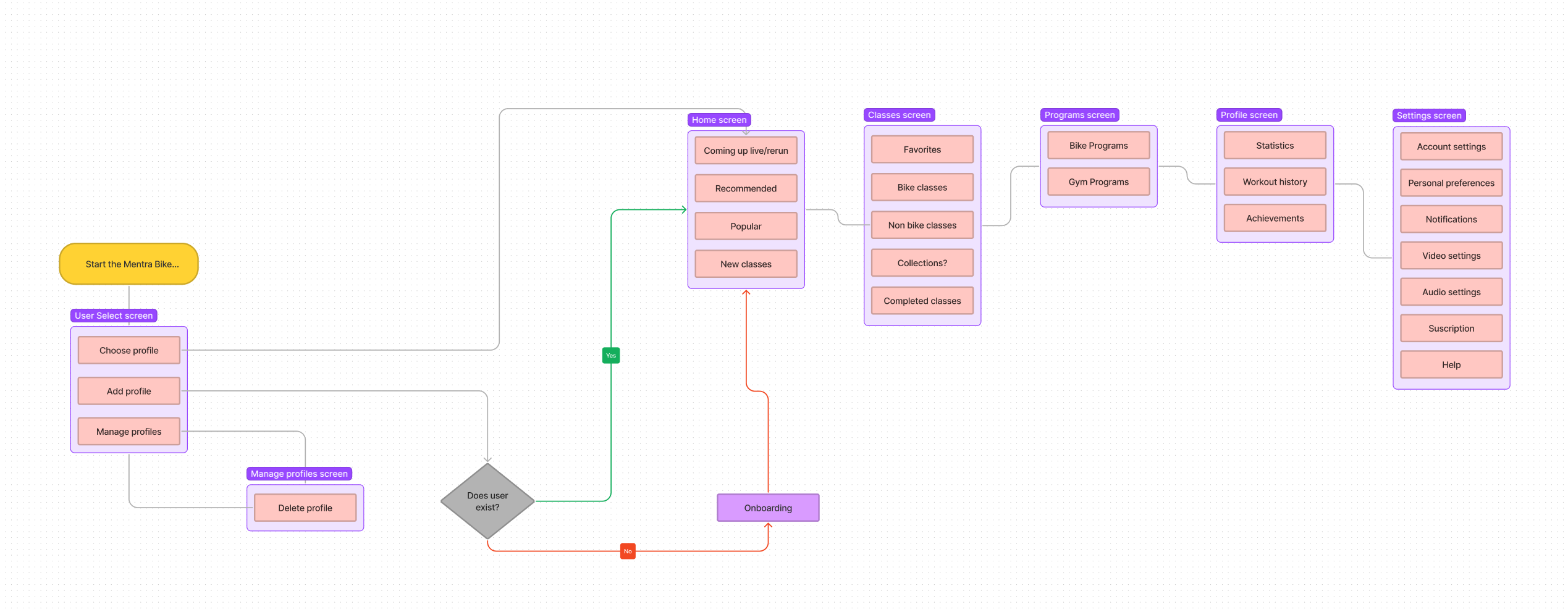
Upon completing a competitor’s analysis, I made the assumption that the flow pictured above would be a good place to start with the bike’s navigation. This would of course be tested with users in a future workshop – something we unfortunately did not get to do before the project was put on hold.
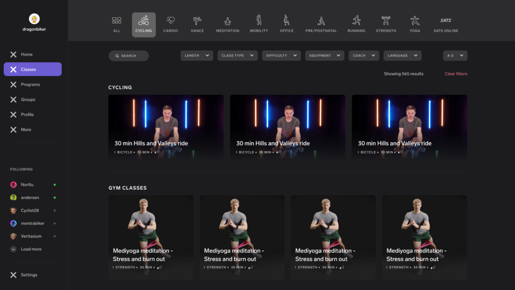
Above is an early iteration of the bike’s interface.
Key takeaways
After two years at Mentra, I’ve done and learned so much that I could extend this project description for at least five more times (don’t worry, I won’t), but the main takeaways are these:
- In a startup, things move fast, and sometimes assumptions are necessary, especially when working alone. Just make sure the assumptions are validated later.
- Accept that all designs are an iteration; user testing should not stop after development as new ideas and feedback will improve my designs.
- Developers need clarity when looking at designs. A clear design system is critical as it minimizes guesswork.
- Developers also need clarity when prioritizing features. Jira, or any other project management system is perfect for this, as long as it is followed up.
- I love UX and I love UI! 💓💓